Keeping Choice Buttons, Subtitles, and Countdowns Clear of the Action: Landscape and Portrait Interaction Guidelines
The interface of an interactive film game is part of the shot composition, not merely a layer over the video. Choices, subtitles, countdowns, and system messages must share safe areas and priorities, with separate validation for landscape, portrait, distant TV viewing, and mobile touch input. The goal is to let players follow the story and operate the controls without competing demands on their attention, rather than to make the UI as invisible as possible.
Introduction
The interface of an interactive film game is part of the shot composition, not merely a layer over the video. Choices, subtitles, countdowns, and system messages must share safe areas and priorities, with separate validation for landscape, portrait, distant TV viewing, and mobile touch input. The goal is to let players follow the story and operate the controls without competing demands on their attention, rather than to make the UI as invisible as possible.
Establish Information Priorities First
Subtitles essential to the story take priority over decoration, current choices over secondary messages, and urgent system errors over countdown animations. Define which layers may appear together at any given moment. If a crucial line of dialogue, four buttons, a timer ring, and a tutorial appear simultaneously, adjust the pacing instead of shrinking all the text.
Allow enough time to finish reading the previous subtitle before choices appear. After submission, briefly retain the selected state to confirm the action, without obscuring the character's initial reaction.
Safe Areas Come from Actual Footage
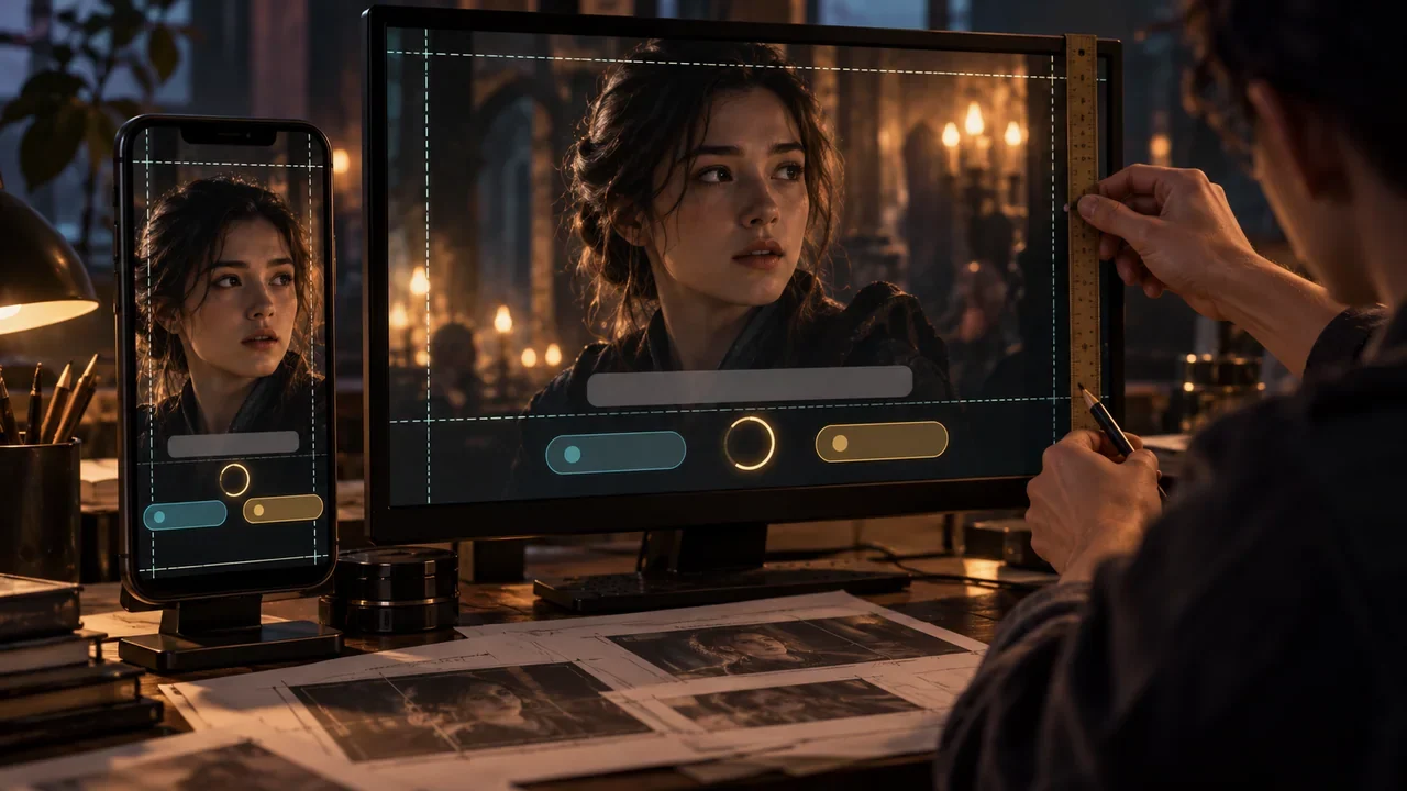
During storyboarding, the director and cinematographer mark areas containing faces, mouths, hands, key props, and action; the UI then defines the available areas. A fixed bottom bar is not necessarily safe: phones, evidence, or subtitles often appear at the bottom of the frame. Top, bottom, left, or right layouts can be selected for each shot, but changes should follow consistent rules so players do not have to search for the buttons every time.
Landscape and portrait are not simply different crops. Portrait may require recomposition, changes to button stacking, and adjustments to subtitle line width. If the core imagery cannot accommodate both, produce separately composed versions instead of automatically scaling it down until it becomes illegible.
Design Choice Text and Touch Targets Together
Each button should express one clear intention, with controlled length and line breaks. Text expands in different languages, so containers should accommodate two to three lines without reducing the font size. Give touch targets adequate size and spacing, and avoid placing dangerous or irreversible choices directly beside the system back area.
Show appropriate prompts for keyboard and mouse, controllers, and touchscreens. Focus order should be predictable, and the current focus should be indicated by more than color alone. Check font sizes at the intended viewing distance for TV use, and test mobile use one-handed, in a landscape grip, and on devices with notches or system gesture areas.
Subtitles Are an Accessibility Feature, Not Stickers
Subtitles need speaker identification, sufficient contrast, adjustable font sizes and backgrounds, and should avoid overly long lines or excessively fast changes. Describe important nonverbal sounds when needed, without giving space to irrelevant details. Providing a subtitle toggle does not complete accessibility work; reading time, obstruction, and character identification also need validation.
The Xbox Accessibility Guidelines offer actionable guidance on subtitle size, contrast, backgrounds, speaker identification, and other aspects. Use them as a testing reference, then establish project standards alongside the requirements of the target platforms. Xbox Subtitle Guidelines
Countdowns Must Be Both Visible and Adjustable
The timer must not convey remaining time through color alone; it can combine numbers, shapes, or progress indicators. Sounds and animations in the final seconds should not create a burden for people with light sensitivity or an auditory burden. Avoid immediately using up the time needed for reading when choices first appear.
Provide options in settings to extend, disable, or pause the timer, and explain whether these change the story's rules. Designs involving time limits should account for differences in reading, cognitive, and motor abilities rather than treating all players as having the same reaction speed. Xbox Time Limits Guidelines
System States Must Not Masquerade as Story Events
Loading, lost connections, corrupted assets, and failed saves require clear system feedback so players do not mistake a black screen for a directorial choice. Messages should explain what happened, whether the system will retry automatically, and what players can do, while preserving their current choice.
Players should be able to safely access the pause menu, volume controls, and subtitle settings from the choice interface; timing rules should resume consistently when they return. If pausing cannot stop a timed choice, explain this before it begins and provide an assistive alternative.
Establish Responsive Component Specifications
Define minimum and maximum widths, line counts, margins, safe areas, animation durations, input states, and accessibility semantics for choice groups, subtitles, timers, messages, and tutorials. Use components instead of manually positioning elements at every node, and handle special shots through controlled variants.
Use pseudolocalization to test long text, mixed characters, and potential requirements for right-to-left languages. Check with system scaling, color vision simulation, low brightness, and screen reading capabilities. Testing by real people on target devices is still required in the end.
Test Attention, Not Just Visual Appearance
Have first-time players watch actual clips, then ask what character action they last saw, what subtitles they read, and how they understood the choices. Eye-tracking equipment is not required: recordings and verbal accounts can reveal problems such as players no longer watching the performance after buttons appear, or subtitles and choices competing to be read. Test three behaviors: choosing immediately, hesitating, and opening settings.
Components should also document focus paths for remote controls, controllers, and keyboards. Button positions may change in responsive layouts, but the semantic order must not become confused with them; back, confirm, and pause should remain consistent across all pages. If swiping or long-pressing on a touchscreen is not a core action, provide clear prompts and alternative inputs.
After every adjustment to a shot or subtitle timing, automatically capture the frame where choices appear for visual regression checks, then have a person check key faces and props. This prevents the UI from quietly obscuring evidence after the final edit.
Next step: capture the ten most crowded actual shots and place subtitles, the longest choices, and countdowns together in landscape, portrait, and TV templates. For any scene that only fits when elements are reduced to a size that is hard to read, return to the editing pace or composition to resolve it.