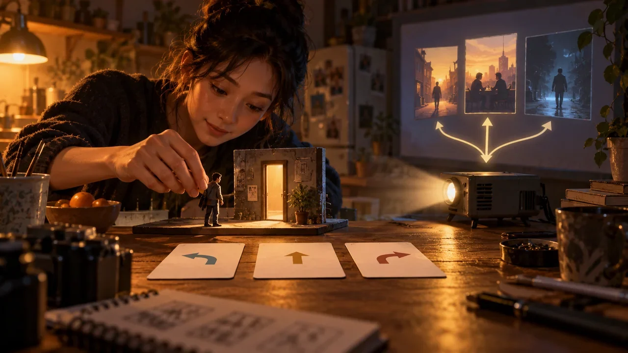
9:16 Interactive Short Dramas Require More Than Cropping Landscape Video: Designing Shots, Subtitles, Choice Buttons, and Pacing Together
Design portrait interactive short dramas that are readable, easy to tap, and do not obscure the story through composition, subtitles, buttons, countdowns, and device testing.
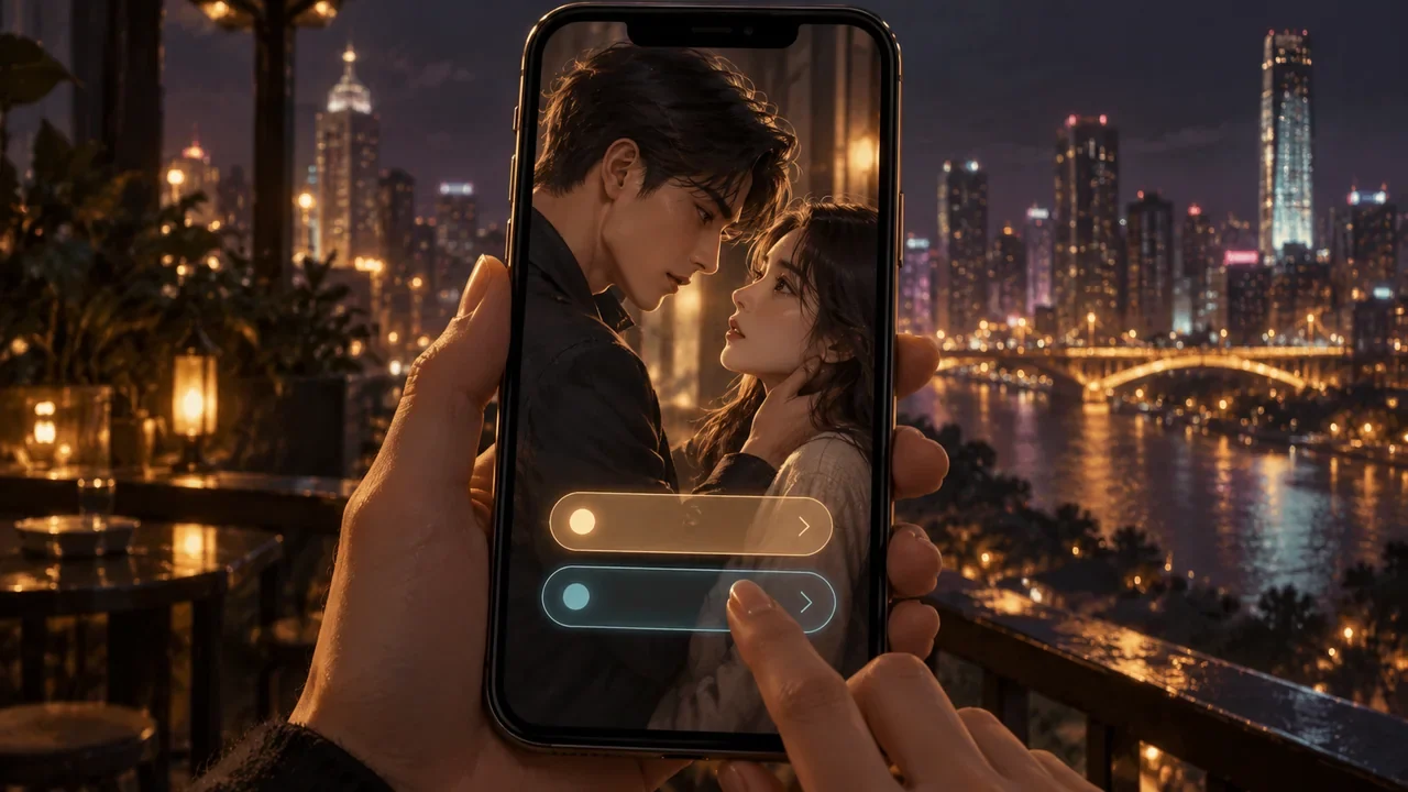
Introduction
Cropping landscape video to 9:16 loses relationship cues, obscures action, and squeezes buttons all at once. Portrait interactive video must place characters, subtitles, and choice UI within a shared safe-area system at the storyboarding stage, rather than adding controls after editing the video.
Composition: Use Depth Instead of Side-by-Side Placement
Relationships between two people can be conveyed through foreground and background, higher and lower positions, and cuts to individual reactions. Before choices appear, key faces and props should be in the central narrative area, with space reserved at the bottom for interaction. Who occupies the upper part of the frame and who is closer to the camera also communicate power; characters should not be positioned arbitrarily just to fit them into the frame.
Subtitles: Finish Reading Before Choosing
After the last crucial line of dialogue ends, allow a brief moment for comprehension before displaying the options. Subtitles and options should not occupy more than three lines at the same time; long choices should be rewritten as short actions, with any necessary explanation placed in the preceding shot. Verify that characters’ faces and buttons remain unobscured when large text is enabled.
Buttons: Make Actions and Costs Readable
“Hand over the key / Keep the key” is clearer than “Trust him / Don’t trust him.” The two buttons should be roughly balanced in grammar, length, and amount of information. Do not make the author’s preferred option more specific or safer.
Countdowns: Show Them Only When the Character Is Also Under Time Pressure
Chases, incoming calls, and doors about to close suit time limits; complex moral judgments, reading long text, and accessibility contexts are better served by pausing or extending the time. Countdowns should include numbers, progress, and non-color cues, and timeout outcomes must be defined in advance.
Pacing: Respond Immediately After a Choice
A tap should produce press, audio, or haptic feedback within about 0.2 seconds, followed by a narrative response within a few seconds. If the actual consequence will not arrive until the next episode, the current scene should still show a small change in a character’s expression or the environment to demonstrate that the input has been remembered.
Cross-Platform Preview Checklist
- Can both small and large screens be operated with one hand?
- Do notches, status bars, system gestures, or platform controls obscure anything?
- Do subtitles and buttons conflict at the maximum font size?
- Are choices retained when switching between landscape and portrait or recovering from a disconnection?
- Are controls readable during screen recording, livestreaming, and screen casting?
Safe areas vary across platforms, so this article provides no permanent pixel specifications and instead requires teams to recheck the items above on target devices. The publication copy presents text rules and checklists without embedding product screenshots.
When portrait interactive design succeeds, players do not notice that the team has “made room for buttons.” They simply see the information clearly at the right moment, understand the costs, and accurately complete their decisions.
Storyboards Must Include Three Interface States
For every choice node, draw the states before options appear, while waiting for a choice, and after confirmation. Before options appear, let key expressions, evidence, or actions finish; during the waiting stage, ensure subtitles, characters, and buttons do not compete for the same space; after confirmation, respond with highlighting, sound, or haptics, and preserve a continuous pose for the next shot. Delivering only one static storyboard cannot reveal the occlusion that occurs when controls actually appear.
When the same footage must work across different screens, first mark the narrative area that must not be cropped, then define an extendable background. Automatic centering may track a face while cropping out a crucial prop. Ordinary transitional shots can be safely reframed, but crucial choice shots are best designed directly for portrait orientation, without relying on fixes after the landscape version is finished.
Copy Needs a Localization Budget
Start buttons with action verbs and keep them at the same grammatical level, such as “Hand over the key” and “Hide the key.” Do not write out the full consequence for one option while expressing only an attitude for the other. Create states for the longest permitted copy, localization expansion, and the system’s maximum font size; when text does not fit, prioritize rewriting it or increasing component height rather than shrinking it into small, hard-to-read text.
Countdowns need four states: starting, nearing the end, paused, and timed out. Complex reasoning or taking a position on a relationship should have no time limit by default; where the story does create time pressure, provide configurable options to extend, pause, or disable the countdown, and explain whether these affect outcomes or achievements.
Test with Real Thumbs and Real Devices
Testers should operate small screens, full-screen displays, and screens with notches or punch-hole cameras using one hand, covering system gestures, recovery from poor connectivity, orientation changes, and interruptions to attention. Record accidental taps, timeouts, subtitles not fully read, taps without feedback, and lost state after returning. Clicking a button with a mouse in a design mockup does not prove that it works on a phone.
Delivery records should preserve test results for safe areas, maximum font size, longest copy, and the final countdown phase as structured text, noting the device and system scaling. Then verify screen-reader order, non-color states, reduced motion, and subtitle readability. The blog publication page does not embed these internal test visuals, avoiding additional page resources and loading overhead.
Warning Signs After Launch
Options displayed without a submitted choice may indicate confusing copy, obscured buttons, insufficient countdown time, or a lagging page; returning immediately after tapping may indicate an accidental tap or an outcome that does not match the promise. Break down the data by device, font, language, and network, then use interaction recordings and interviews to identify the cause.
Do not interpret every instance of not choosing as hesitation over the story. Technical failures and hesitation caused by design require entirely different fixes; only combining event records with testing on real devices can distinguish the two.