Interactive film choices cannot rely on color alone: contrast, shape, and state cues
Keep choices distinguishable over moving footage with text, shape, position, and state feedback while testing text contrast, non-text contrast, and actual target size.
Introduction
Color can support mood, but it must not carry the sole meaning of available, selected, dangerous, or disabled. Choices need text, shape, position, or state feedback that survives different vision, screens, brightness, and moving backgrounds.
Interactive film accessibility cannot be reduced to a subtitle check before launch. The choice interface, playback controls, branch state, and media content form one complete journey. If any layer cannot be perceived, operated, or understood, a viewer can lose the means to continue. WCAG 2.2 defines the principles of perceivable, operable, understandable, and robust web content. This article translates relevant guidance into a production method for interactive film. It does not claim that following one article proves conformance; teams still need to confirm platform, market, and user-testing requirements.
Write an experience promise that can be accepted or rejected
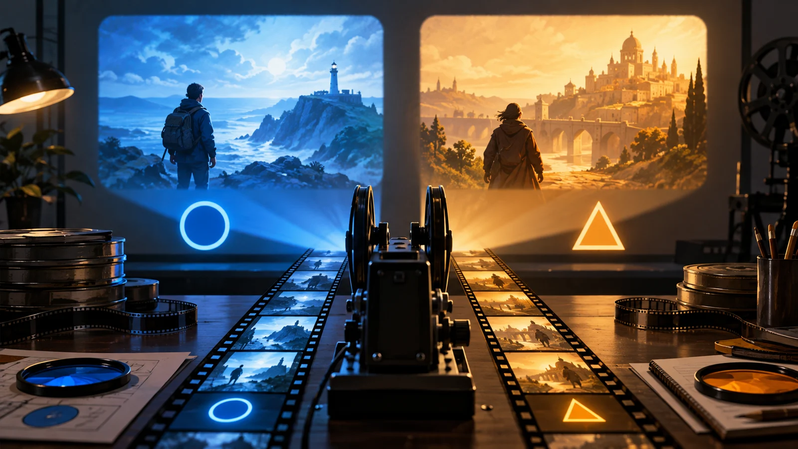
H05 places translucent red and green options over a darkroom shot for following footsteps or staying. On a dim projector both approach black, and viewers with different color perception cannot identify focus from hue alone.
The examples use a fictional short film, The Letter from Fog Harbor. A viewer investigates a swapped letter at night and chooses among a warehouse, a waiting room, and a lighthouse. All people, routes, test records, and asset IDs are original teaching material. They are not real user research, completed test results, or automatic DramaFork features.
Start with one experience promise and one failure condition. The promise names who must complete which task, on what device, and under what condition. The failure condition identifies the point at which release must stop. “A keyboard-only viewer can complete every choice” is testable; “keyboard friendly” is not. Check text, boundary, focus, and state contrast separately. Add distinct shapes, clear action verbs, and fixed positions beyond red and green. Explain disabled items instead of only fading them. Make the visible and actionable target areas match, with adequate space between them.
Connect requirements, implementation, and evidence
| Field | Question | Evidence |
|---|---|---|
| Viewer task | What must the viewer perceive, decide, or control? | A concise task and context |
| Interaction rule | Does the default and alternative path reach the same result? | Input, focus, timing, or presentation rule |
| Branch effect | Do settings, backtracking, and re-entry preserve story state? | Entry, exit, and retained-state record |
| Acceptance | Who tests which device, and where does a failure return? | Route ID, action log, and owner |
H05 pairs a footprint shape with Follow and a shield shape with Stay. A double outline marks focus and a brief action response confirms selection. A stable dark backing appears as the shot changes so legibility never depends on a lucky frame.
All four fields must refer to the same version. Updating a mockup without the route record makes it impossible to tell whether an old defect is fixed. Updating code without the experience promise turns “the control responds” into a false claim that the viewer understood it. Editorial, interaction, engineering, and QA are accepting a repeatable journey, not a screenshot.
Put the requirement into the production workflow
First, inventory the main route, short route, backtrack route, and no-input route. Mark every choice, playback control, and essential piece of information. Second, give each task a default and an alternative method that reach the same narrative result. Third, bind the rule to stable scene IDs, asset IDs, and state fields so that copy edits do not destroy traceability.
Fourth, test cheaply before polishing: complete a route by keyboard, at enlarged text size, with motion reduced, and after pausing and returning. Fifth, run cross-device and assistive-technology checks while recording steps, expected results, actual results, and evidence. Sample the brightest, darkest, and highest-motion frames from every branch. Check normal, dim, magnified, and varied color-perception conditions, then confirm on real devices. Measure text, boundary, focus, and state graphics rather than one swatch in a mockup.
A useful record does not say “looks fine.” It says: “Enter at H02, enable the alternative setting, choose the left action, verify clue_letter=true, and confirm that H03 acknowledges it.” That record covers entry, action, feedback, and exit. When it fails, the team can locate the fault in input, presentation, or narrative state.
Most failures occur at system boundaries
Changing selected blue to purple without another cue still relies on color. Enlarging the visual control while leaving a small hit area creates error. Heavy shadows on all text may improve a local ratio but damage captions and image reading. Correct each information layer separately.
Accessibility controls also fail when they are buried in a settings page that an affected viewer cannot reach. Provide a discoverable entry at launch, at the first choice, and in the pause menu. A changed preference needs immediate perceivable feedback and must remain active at the next node. If it disappears after reload, fix it or disclose the limitation before release.
Automation can flag missing names, some contrast problems, and some focus defects. It cannot decide whether choice copy is understandable, whether audio description spoils another branch, or whether pausing breaks narrative comprehension. Route testing and participation by disabled users remain essential. Return content defects to editorial, media defects to sound or post-production, state defects to engineering, and scope conflicts to the accountable owner.
Release gates must cover the complete process
Every essential choice remains distinguishable without color; text, boundaries, and focus survive the brightest and darkest shots; visual and actionable targets match; disabled, focused, and confirmed states cannot be confused.
The minimum release packet contains the feature scope, route inventory, preference defaults, interface copy in all five locales, devices and input methods tested, known limitations, defect owners, and one end-to-end record from opening to ending. W3C sources provide standards and explanatory guidance. The tables, node labels, and fictional case here are an editorial method, not a mandated W3C template.
One contrast reading cannot represent a moving background. Displays, projection, and ambient light change the result, so retain numeric checks, frame sampling, and viewing-environment tests.
For the final check, ask someone outside the production team to reproduce the experience from the record. If they still need to ask what to press, how much time remains, what a cue means, or where a resumed session begins, the handoff is incomplete. Write the answer back into the rule and its evidence before publishing.
Sources: W3C Understanding SC 1.4.3: Contrast (Minimum); W3C Understanding SC 2.5.8: Target Size (Minimum).